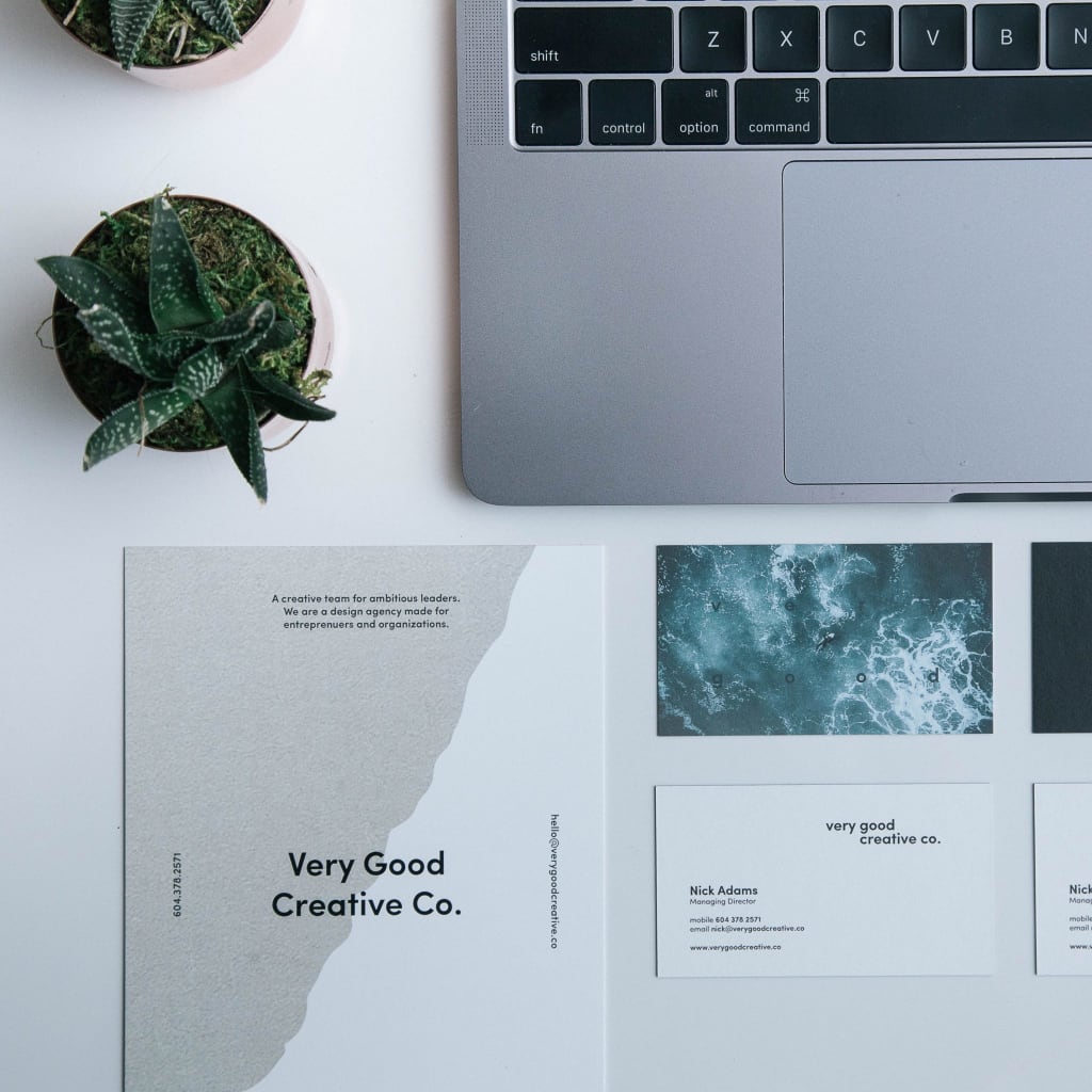
So how does a consistent aesthetic help engagement?
As a lot of us know, the first thing that catches our eye on an instagram account is how well laid out the feed is
A grid with consistent and well curated photos will always stand out compared to one without these factors.
In this blog post we will cover:
- – Why a consistent aesthetic is important
- – Creating a ‘brand bible’ for your business
- – Upkeep the aesthetic you’ve chosen
- – How to carry this out across your platforms
What is brand aesthetics and how to create a brand aesthetic?
First, we need to make sure you know what brand aesthetics are and how they are created. A brand aesthetic refers to the appearance of your content. The style you choose will demonstrates your brands personality.
Brand aesthetic will b made up of lots of elements from colour palette, logo and typography to the style of graphics you use.
All these decisions need to by thought about and carefully considered.
Why a consistent aesthetic is important

Having a consistent aesthetic across your social media platforms and on your website gives customers an instant idea of what your brand is about.
There are a few different ways you can give your customers an idea of your businesses theme:
- – Using the same graphics or the same style of graphics across all your platforms.
- – Making sure the same logo is used on all your social media, websites and emails.
- – Having the same colour palette across these platforms keeps everything cohesive.
- – Ensuring the same fonts are used for emails, graphics and in your logos so they are all the same.
By carrying out these simple steps you can ensure your brand or business has a clear and concise theme across all it’s platforms.
This not only makes it easier for your customers to follow everything to do with your brand but also builds up a good and cohesive style which looks well put together.
The style of your brand should be obvious across everything you do.
A brand should have a consistent style that is carried out so everyone viewing it instantly knows it’s you.
Some of the best and most successful brands can be distinguished purely from their logo or colour scheme, even when the name of the brand is not visible.
This makes the brand universal in recognition which is essential when it comes to ensuring your business is successful.
Creating a ‘brand bible’ for your business

So what is a ‘brand bible’?
If you haven’t heard of one before, a ‘brand bible’ is a document you can make that houses all of the themes, colour palettes and graphics that you will use for your brand.
Your ‘brand bible’ can be a guide for any of your employees to use when creating various content to do with your brand.
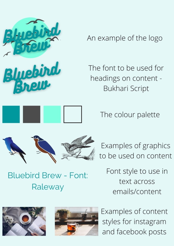
A well designed ‘brand bible’ will include:
- – A logo
- – A font to be used across the brand
- – An email header and footer
- – A few graphics to be used on content
- – A colour palette to be used across the brand
- – H2 or title fonts
Here is an example of just a simple ‘brand bible’ for a made up business we’ve called ‘Bluebird Brew’:
Why brand aesthetic is important

Having a theme like this for your business ensures aesthetic consistency across all your platforms and helps your colleagues create content for the brand that sticks to a theme.
Upkeep the aesthetic brand marketing you’ve chosen

Once you’ve chosen your brand’s theme and created a ‘brand bible’ it’s important to keep to this theme.
If in the future your business evolves and develops, you can rebrand your business with a new theme but until that happens, keeping the theme consistent is key.
This should be fairly simple to do if you like the style you’ve chosen.
It’s a great idea to test the theme before you officially roll it out across your brand.
This gives you the opportunity to test how the fonts work in different ways and ensures assets such as the logo will look good on various platforms.
For example, the logo may work well for labels on your product but may not work as well on the header of an email where it is smaller and harder to read if the font is too small.
Make sure you know all the areas in which these features will be used so you can test them first and be certain that they work well across all the platforms your brand uses.
Another example of testing this out is when you are creating content.
A great way to test whether the content you’ve created for instagram will look good on the feed is to make a mockup of the top 9 photos on your grid.
Pre-making a few weeks worth of content photos allows you to view what your grid will look like in a few weeks time when all of them have been uploaded.
It’s always a great idea to pre-make content anyway so you are ahead of the game and can schedule the content ahead of time.
Doing this also allows you to keep a consistent theme as you are making future content all at once and can see what it will look like weeks in advance.
How to carry this out across your platforms

Firstly, make sure your team is onboard with the style of the brand and is happy to ensure that all platforms are kept to this style.
Once you’ve decided on that, it’s important the assets you’ve got keep within the theme.
Making sure your content photos on instagram have a similar colour palette and are of the same elk is really helpful too.
When it comes to email styles, using a similar pre-set layout helps and ensuring the same logo is used across all emails sent out lets viewers know it’s you instantly.
When it comes to website design, make sure the logo is used and the colours across the website match your styling.
Using the same fonts across the website is a great way to keep things coordinated. All pages should use the same fonts for their bulk text and titles.
These fonts can be used on graphics, content and emails too.
We hope you’ve learnt how to keep your brand consistent and use these skills to propel your business on all your platforms! For more help and advice, why not get in touch with us?